Best Wood Flooring Colours for Commercial Interiors in 2026 — Contractor Spec Guide
Best Wood Flooring Colours for Commercial Interiors in 2026 — Contractor Spec Guide
The ultimate 2026 contractor guide to wood flooring colour specification for commercial interiors – the eight major colour directions, which are rising and which are declining, a 12-application specification table, the stone and surface pairing logic for each colour, the practical durability considerations that influence colour choice in high-traffic environments, and the ordering rules for colour consistency across large commercial developments. Data throughout from NWFA & NAHB.
Best wood flooring colours for commercial interiors in 2026.
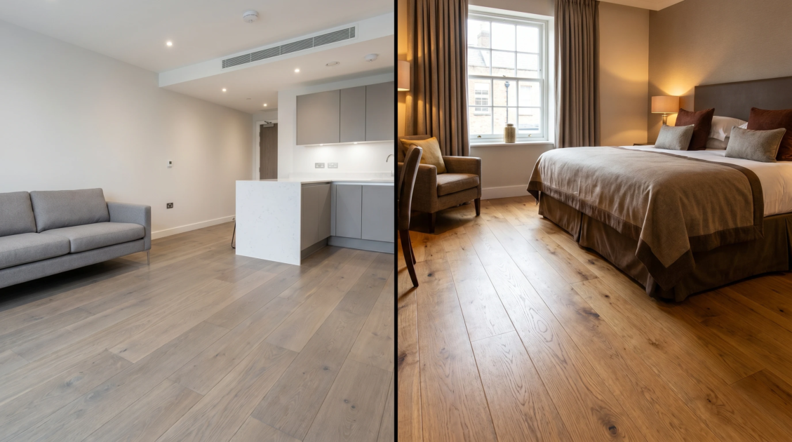
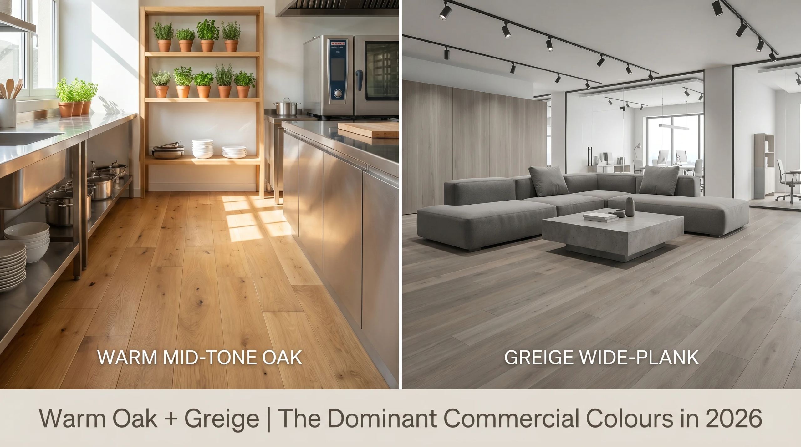
Commercial Wood Flooring Colors 2026 The best commercial wood flooring colors in 2026 include warm mid-tone oak, greige wide-plank and pale ash—all in the warm-neutral to cool-neutral tonal spectrum that complements the stone countertop and wall material specifications typical of commercial interior design in 2026. Dark espresso and black-stained floors have taken a nosedive in commercial specs. Light blonde and whitewash tones are strong in the premium residential and boutique hospitality markets. The right color depends on the commercial application, ceiling height, the stone or surface it’s teamed with, and the brand or project brief.
| The TOP 5 commercial wood flooring colours of 2026:
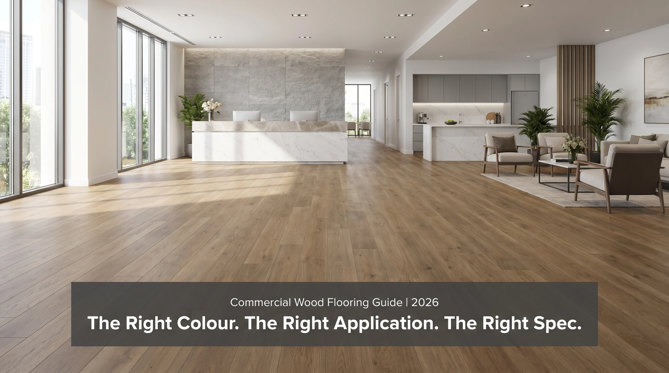
Natural to honey warm mid-tone oak Dominant commercial specification 2026. BTR, hotel rooms, corporate offices, premium retail designs. Goes well with grey and white stone countertops Greige wide plank (warm grey-beige): The ultimate BTR and co-living flooring colour for 2026. Neutral enough to be consistent across many units but warm enough to avoid being clinical. Pale ash or cool blonde Growing in corporate offices, open-plan commercial. Pairs with cool grey and white stone. Creates perceived space in commercial environments with lower ceilings. Brushed grey-brown or smoked: High-end residential and premium boutique hospitality. Sophisticated, contemporary and design led. Works well with dark granite or dramatic marble. Whitewash or bleached oak Mainly in coastal and Scandinavian-influenced boutique hotel and premium residential. Light & Airy, Unique. Great for high ceiling spaces. Pack Universe Supply – Wholesale contractor pricing, no minimum first order. All commercial colours of engineered hardwoods and SPC wood-look flooring. Call +1 704-951-7822 packuniversesupply.com/request-a-quote |
In 2026, warm-neutral and greige mid-tones are now the firmly established colour specification for wood flooring in commercial interiors, moving away from the dark espresso and high-contrast black-stained floors that were commonplace in commercial specifications a decade ago.
This is driven by three converging forces. For one thing, in commercial interiors in 2026, the dominant stone and surface palettes—white and grey quartz countertops, grey-veined marble, cool porcelain—are naturally paired with warm-neutral and pale wood tones, rather than dark floors. Secondly the build-to-rent and co-living sectors, which are now the biggest single volume of commercial flooring specifications in the USA, have standardised on greige and warm oak as the brand-neutral colours that photograph well, feel residential and work across all unit types. Thirdly, the visual impact of the colour has been enhanced by wide-plank installation formats – a wide-plank greige floor is a very different read to the same colour in a narrow strip format.
This guide covers all eight major commercial wood flooring colour directions in 2026, trend momentum for each, applications each one suits and the stone pairing logic behind each specification. Across the data from the National Wood Flooring Association and the NAHB.
- Colour Landscape in 2026 – What Goes Up, What Goes Down
In 2026, the most popular commercial wood flooring specs are warm-neutral oak and greige wide-plank. The days of dark espresso and black-stained finishes are long gone in commercial briefs. Pale ash and cool blonde are creeping into corporate and open plan environments.
The commercial flooring color landscape in 2026 is best understood as a spectrum from warm to cool, with dominant specs clustered in the warm-neutral to cool-neutral middle ground rather than at either extreme. Very dark and very light floors still have their place in certain brief-led applications – dark smoked floors in boutique hospitality, whitewash in coastal wellness – but neither is appropriate as a default commercial specification.
Natural and honey oak tones made up 38 percent of commercial engineered hardwood orders in the USA, the highest single-colour category share in the commercial segment, according to data from NWFA 2025 commercial specifications. Greige and warm-neutral wide-plank SPC and LVT made up 31 percent of commercial resilient flooring orders. Together the warm-neutral segment forms the clear majority of 2026 commercial floor colour specifications.
| Quick answer:
NWFA 2025 data shows warm mid-tone oak to be the top commercial wood flooring color in 2026, accounting for 38 percent of commercial engineered hardwood orders. Wide-plank in greige and warm-neutral accounts for 31 percent of commercial resilient flooring Together these warm-neutral tones constitute the majority of commercial floor specifications in 2026. |
| Industry Statistics:
NWFA 2025 (nwfa.org) – In the USA, 38 percent of commercial engineered hardwood orders were for natural and honey oak. The top commercial color direction for 2026 was a combination of greige wide-plank and warm-neutral SPC, which accounted for 31 percent of commercial resilient flooring orders. NAHB 2025 (nahb.org) — Greige or warm oak will be the standard flooring spec for build-to-rent developers’ 2026 developments, with 67 percent of those surveyed reporting it as the go-to, citing multi-unit color consistency, photography performance and pairing flexibility with white and gray kitchen surfaces. |
| The one thing to remember,
Warm mid-tone oak and greige wide plank are the safe, commercially proven specifications for 2026. If the brief does not specify a distinctive colour direction, these are the two colours that deliver the broadest appeal, the strongest photography performance and the easiest stone pairing across the widest range of commercial interior applications. |
The full 8-colour reference table for all major commercial wood floor colour directions below. Trend momentum and best application and stone pairing logic for each:
-
All Eight Colour Directions The Complete Reference
Eight wood flooring colour directions for commercial interiors, with trend momentum, best application and the stone or surface pairing logic that makes each one work.
The column titled Trend Direction utilizes directional indicators—DOMINANT, RISING, STABLE, DECLINING—that are based on NWFA commercial order data and NAHB developer purchasing surveys. The Stone Pairing column is the critical specification connection between the floor and countertop or wall surface – the pairing that makes for a unified commercial interior, as opposed to two good materials that do not relate to one another.
| Wood Floor Colour | Trend Direction 2026 | Best Commercial Application | Stone or Surface Pairing |
| Warm mid-tone oak (natural to honey) | ⬆ DOMINANT — strongest commercial specification | BTR kitchens and living areas, hotel rooms, corporate breakout spaces, premium retail | White, cream, and warm-veined quartz. Calacatta marble. Warm beige granite. Avoid cool grey stone. |
| Greige wide-plank (warm grey-beige) | ⬆ RISING — BTR and co-living standard | Build-to-rent all tiers, co-living spaces, serviced apartments, extended-stay hotels | Grey quartz, white quartz, neutral porcelain. The most versatile stone pairing in 2026. |
| Pale ash or cool blonde | ⬆ RISING — corporate and open-plan | Corporate open-plan offices, co-working, budget-to-mid hotel rooms, large-format retail | Cool white quartz, grey porcelain, light neutral stone. Maximises perceived space. |
| Smoked or brushed grey-brown | → STABLE — premium boutique tier | Boutique hotels, luxury residential, premium co-working, design-led hospitality | Dark granite, dramatic marble (Nero Marquina), honed dark stone. High contrast pairing. |
| Whitewash or bleached oak | → STABLE — coastal and Scandi boutique | Coastal boutique hotels, Scandi-influenced premium residential, wellness hospitality | White honed marble, pale quartz, light stone. High-ceiling spaces only — feels low in compact rooms. |
| Warm walnut or dark bronze oak | ⬇ DECLINING — fading from commercial | Heritage hospitality, traditional residential — avoid for new commercial specifications | Dark wood pairs poorly with most 2026 commercial stone palettes. Not recommended for new commercial. |
| Espresso or black-stained | ⬇ DECLINING — significant retreat | No longer recommended for new commercial specifications in 2026 | Black-stained floors are dated in commercial contexts. SPC and LVT with dark tones declining. |
| Rustic or distressed oak (high variation) | → NICHE — specific contexts only | Farmhouse hospitality, artisan retail, specific brand-led briefs | High variation floors require careful pairing — avoid with highly polished stone. Honed or leathered stone only. |
| Quick answer:
Two colors that are no longer in commercial specifications and to be avoided for new projects in 2026 are espresso/black-stained and dark warm walnut. Both read as dated in commercial interiors against the warm-neutral and greige stone palettes dominating new commercial design. Instead, go for warm mid-tone oak or greige. |
Why Dark Floors Are Falling Out of Favor in Commercial Specs
Beyond aesthetics, there are three practical reasons that explain the decline in commercial use of dark espresso and black-stained wood flooring. Firstly they show dust, debris and footprints more than mid tone floors – increasing the frequency of cleaning required to maintain an acceptable appearance in a busy commercial environment. Second, they don’t photograph well for development marketing materials — dark floors in apartment and hotel photography reduce the perceived brightness and space of the room. Third, in commercial interiors in 2026, the dominant stone and surface palette – white quartz, grey stone, light porcelain – creates a high-contrast combination with dark floors that can be read as visually heavy, rather than intentionally designed.
For contractors who get a brief that says dark floors in a commercial project, the practical conversation is whether the operational maintenance and photographic implications have been factored in with the aesthetic intent. There are still places – high-ceilinged boutique hotel lobbies, fine-dining venues with a purposeful dramatic character – where dark floors still make sense. They have been displaced as a mainstream commercial material.
The BTR development marketing team who get the apartment photography and notice the dark-stained floors that have absorbed all the natural light and made every room look smaller than the floor plan suggests are having a conversation the flooring specification should have prevented. Bright snaps of warm oak and gray flooring. Dark floors photograph heavy.
| The short answer:
Dark espresso and black stained wood floors show dust and footprints more than mid tone floors, photograph poorly in development marketing materials, and make visually heavy combinations with the light stone palettes that dominate 2026 commercial interiors. If you have marketing photography and operational maintenance in the brief evaluation for any commercial project, specify warm mid tone oak or greige. |
- Commercial Use of Wood Flooring Colour Specification Reference
The right wood flooring color and material type for every major commercial application in 2026 — with the specification logic behind each recommendation.
Before you place any commercial wood flooring order, take a look at this table. The Specification Logic column gives the rationale – the explanation you need to give to a developer, hotel operator or commercial interior designer who questions the specification, for each colour recommendation.
| Commercial Application | Specify | Specification Logic |
| BTR apartment — kitchen and living | Greige wide-plank or warm mid-tone oak — engineered hardwood or SPC | The two dominant BTR colours in 2026. Both pair with white/grey quartz kitchen countertops. Greige for neutrality across all units. Oak for warmth at premium BTR tier. |
| BTR apartment — bedroom | Warm oak or greige — consistent with living area | Match or tonally complement the living area floor. Consistency across unit is more important than bedroom-specific specification. |
| Hotel room — standard and mid-range | Greige or warm oak — SPC with wood-look surface | SPC not real hardwood at standard tier — maintenance and durability essential. Warm tone creates residential feel in the room. Must be consistent across all rooms. |
| Hotel room — boutique and luxury | Warm oak or whitewash — real engineered hardwood | Real hardwood is the specification signal at boutique tier. Wide-plank warm oak or whitewash depending on hotel brand aesthetic. |
| Corporate office — open plan | Pale ash or cool blonde — engineered hardwood or SPC | Cool pale tones maximise perceived space in open-plan. Pairs with grey or white stone reception and kitchen surfaces. |
| Corporate office — executive suite | Warm mid-tone oak or smoked grey-brown — engineered hardwood | Premium material at senior level. Warm oak for traditional authority. Smoked grey-brown for modern design-led authority. |
| Co-working space | Greige or pale ash — SPC or engineered hardwood | High-traffic commercial. SPC where durability is paramount. Greige for brand-neutral versatility across tenant types. |
| Boutique hotel — lobby and corridors | Smoked grey-brown or whitewash — wide-plank engineered hardwood | The lobby floor defines the hotel’s quality register. Wide-plank hardwood in a design-led colour communicates quality immediately. |
| Premium retail — flagship | Warm oak or smoked grey-brown — wide-plank engineered hardwood | Floor material is part of the brand experience. Wide-plank warm oak is the most versatile premium retail floor in 2026. |
| Wellness and spa | Whitewash or pale ash — engineered hardwood | Matte, natural, organic — the wellness floor aesthetic. Pale tones align with stone and natural material palettes in wellness interiors. |
| Restaurant — dining area | Warm oak or smoked grey-brown — engineered hardwood | Restaurant floor must read as premium and warm. Oak creates hospitality warmth. Smoked grey-brown for fine dining and contemporary restaurants. |
| Serviced apartments — all areas | Greige wide-plank — SPC or engineered hardwood | Consistent across all units. Zero-maintenance SPC for serviced apartment long-stay use. Greige is the most commercially versatile specification. |
| Quick answer:
The BTR and serviced apartment rows in this table both specify greige wide-plank as the standard, not because it is the most visually exciting option, but because it is the most operationally appropriate. Greige is versatile enough to be used with any stone or surface specification throughout the development, consistent enough to be ordered in volume from a single lot, and neutral enough to work across all unit types and tenant profiles. |
| The hotel specified a whitewash floor in standard 28 square metre rooms as it was in the design brief and looked right in the mood board but has created a floor that feels clinical in a small room and shows scuff marks on every skirting edge. Whitewash is high-ceiling, generous-space specification. In a tiny hotel room, you have a design chat before you order, not a damage limitation chat after installation.
Considering wood flooring for a commercial interior project? Let us know your commercial application, unit count, stone specification and preferred colour direction and we’ll confirm stock availability and give you a wholesale quote within 2 business hours. +1 704-951-7822 packuniversesupply.com/request-a-quote |

- Commercial Interiors Color Selection Durability Issues
In commercial settings, the color of the wood flooring is not just a visual choice – the color has a direct impact on how quickly surface wear, scratching and maintenance marks become visible in high traffic commercial use.
In residential locations, minor surface scratches, small dents and daily wear marks are part of the lived-in character of a wood floor – noticed rarely and accepted as normal. In a commercial hotel room, a BTR apartment photographed for marketing, or a corporate office reception, the same level of wear is read as a failure of maintenance. Color specification for the floor affects the visibility of wear.
Mid-tone floors hide wear better than light or dark ones.
Warm oak and greige in the natural to honey range are the most forgiving mid-tone wood floor color palette for commercial high-traffic environments. Their tonal range is broad enough that small scratches, minor dents, and everyday wear marks disappear into the natural variation of the floor grain, instead of standing out as damage. Light floors in pale ash and whitewash show surface marks and scuff damage more clearly than mid-tones. Espresso and smoked dark floors show dust, debris and every light scratch against their deep ground color.
This wear visibility characteristic is not a reason to avoid light or dark floors in all commercial applications – it is a reason to consider it in the specification conversation. A dedicated cleaning programme is appropriate for a whitewash floor in a boutique hotel lobby. The same floor in a busy hallway without increased maintenance is a floor that will look worn out in 18 months.
Type of Finish Affects Wear as Much as Color
Wood floors with a matte or satin finish hide surface scratches better than a high-gloss finish — the low sheen won’t reflect the fine light lines scratches leave on the surface. All commercial hardwood engineered specifications are recommended in a standard matt or satin finish. High gloss finishes look fantastic day one but in commercial environments will show every micro scratch by month three. UV oil finishes are very durable and repairable in situ – the preferred specification for any commercial application where the floor may require localized maintenance between full-floor service events.
| ⚠ Real Risk – Real Consequence:
The risk: engineered hardwood with a high-gloss finish in a high-traffic commercial setting such as a hotel hallway or open-plan office. The result? Micro-scratches from furniture, shoe heels and cleaning equipment appear on the surface within weeks of installation. High gloss finishes tend to reflect light and show imperfections more than matte finishes. The floor looks tired before its time — and needs a full re-finishing to get the look back. |
| Short answer is :
All commercial orders of engineered hardwood are available in a satin or matte finish. In high traffic commercial environments, high gloss finishes will show surface wear in a matter of weeks. UV oil finish is the preferred finish for commercial applications where localized maintenance is required on site between full floor servicing events. |
- Order for Color Consistency on Large Commercial Developments
The same discipline applies when it comes to stone countertop orders for a large commercial development – confirm the batch, reserve the full quantity and verify on every delivery – as it does to wood flooring color consistency.
Because engineered hardwood and SPC flooring products are produced in batches, each batch of a given shade may have some shade variation. Different manufacturing runs of the same colour name may have slight differences in tone, grain character and surface texture. For example, in a 50-unit BTR development where floors are installed in multiple phases of construction, you can see shade variation between phases when residents move between units or the units are photographed for marketing.
The correct way to handle large commercial flooring orders is similar to the stone lot matching process: confirm the production batch code prior to Phase 1 being shipped, reserve the full development quantity from that batch, specify V1 shade variation classification, and confirm the batch code on each delivery note. In particular for engineered hardwood, also confirm in writing the wood species, grading and surface finish specification. These can vary between batches of the same named product if manufacturing tolerances change between runs.
- Confirm production batch code Before phase 1 shipment. Ask the supplier for written confirmation.
- Reserve full development quantity from confirmed batch, including 10-15% waste allowance plus contingency planks per floor area.
- Specify V1 shade variation classification: V1 refers to the lowest available colour variation between pieces and batches.
- Batch code on each delivery: Check the batch code on delivery documentation before accepting each phase.
- Hold contingency stock from confirmed batch: One box per 50 sqm as lot-matched replacement stock for damage events
The BTR developer has a colour inconsistency problem that is visible in every marketing photograph, in every unit viewing and in every resident conversation about why their floor looks different from the one in the showroom unit, because the batch was not reserved, so the Phase 1 floors look a little warmer than the Phase 2 floors. The batch reservation discussion is free. The colour mismatch is far more expensive.
| Short answer:
All commercial wood flooring development orders over 10 units (engineered hardwood and SPC flooring) require production batch confirmation. “Batch confirm, reserve full qty, V1 shade variation, verify on delivery”. Same process as stone lot matching. If skipped, the same result. |
| How Pack Universe Supply can assist with commercial wood flooring orders:
Pack Universe Supply in Charleston, SC offers engineered hardwood and SPC wood-look flooring in commercial colors – warm oak, greige, pale ash and smoked grey-brown in wide-plank formats – from our wholesale warehouse. For large development orders: We confirm production batch codes before Phase 1 ships, we reserve full development quantities, and we provide physical samples from confirmed batches for sign-off before full-volume orders are placed. When contractors are matching wood flooring with stone countertops across a development: We stock both materials and can confirm tonal compatibility between floor and stone samples from confirmed batches before any order ships. Commercial Flooring Availability: +1 704-951-7822. |
| Wholesale Wood Flooring for Commercial Interiors – No Minimum on First Order
Engineered hardwood and SPC in commercial colors – batch confirmed, wide plank, development ready. Charleston SC (US) | Burlington ON (Canada) | Delivered Across the Country. Request a Quote: packuniversesupply.com/request-a-quote Phone: +1 704-951-7822 (Monday–Friday, 8am–5pm EST) → Canada: +1 (647) 362-1907 | WhatsApp: button on packuniversesupply.com |
Top Wood Flooring Colors for Commercial Interiors in 2026 Verdict
Conclusion:
Warm mid-tone oak and greige wide-plank are the top commercial wood flooring specs for 2026, making up most commercial engineered hardwood and SPC orders. Both pair naturally with the white, grey and warm-veined stone surfaces that define 2026 commercial interior palettes. They both photograph well in development marketing. Both retain an acceptable appearance under commercial high-traffic use without enhanced maintenance programmes.
Pale ash and cool blondes are coming into play in corporate open-plan environments where ceiling heights can support the lighter tone and the stone palette is cool rather than warm. Smoked grey-brown and whitewash are still going strong in boutique hospitality and wellness where the brief specifically supports it.
Dark espresso and black stained floors are becoming obsolete in commercial specifications and should not be the default commercial colour in 2026. The maintenance burden, photography performance and stone pairing limitations mean they are only suitable for certain short-led applications at the boutique or fine dining level.
Commercial engineered hardwood, matt or satin finish to be specified. Production batch to be confirmed before any development order shipped. The visual decision is the colour. The operational discipline is batch confirmation.
| Sources & References
NWFA — National Wood Flooring Association, Commercial Specification Survey 2025: nwfa.org | NAHB — National Association of Home Builders, Developer Purchasing Survey 2025: nahb.org | Pack Universe Supply commercial flooring order data, April 2026. About the Author Sam Michaele with 15 years of on-the-ground experience supplying engineered hardwood and SPC flooring for commercial interior projects across the USA and Canada — including BTR, hotel, corporate and boutique hospitality projects. Pack Universe Supply has wholesale warehouses in Charleston, SC (USA) and Burlington, ON (Canada). |