How to Match Countertops with Flooring in Large Developments — The Complete 2026 Guide
How to Match Countertops with Flooring in Large Developments — The Complete 2026 Guide
Contractor’s 2026 guide to matching countertops with flooring in large scale residential & commercial developments-the 4 principles of effective material co-specification, the 8 combinations reference chart, tone harmony versus value contrast explained, zone definition for open plan designs, which combination failed at scale and why, managing consistency for 60 identical units, and which spec will solve your single most common development material mismatch. NKBA & NAHB figures and research included.
| So, how do developers pair countertops and flooring in huge developments, and how do you ensure the two don’t clash?
In large developments, countertops and flooring are paired based on four key principles: tone harmony (warm-to-warm, cool-to-cool), value contrast (different lightness/darkness so one doesn’t fade into the other), material register consistency (natural stone with natural stone or a wood look, engineered with engineered), and application zone logic (kitchen countertops and living room floors are different). If you’re designing 60 identical units, you only need one smart decision, not 60 independent ones. Combination rules that work at development scale: Dark granite + light oak SPC floor: High contrast and visually clean. Countertop pops as a piece; floor recedes. This looks good at any room size. White or light quartz + warm greige SPC floor: Low contrast and cozy. This one blends well. Both surfaces are within the same warm neutral range and works especially well in an open floor plan. Mid-tone granite + mid-tone SPC floor:Risky at scale-this can create an undifferentiated, flat feel as both the countertop and floor compete at the same lightness level and lack contrast. Texture or a distinct difference in tone is needed to break it up. Quartzite + wide-plank engineered hardwood: Premium register. This natural-on-natural look is great for luxury BTRs or boutique hotels, where both materials are expected and appreciated. Kitchen Zone: Granite or Quartz + Living Zone: SPC or hardwood: Zone separation through materials creates visual interest in an open floor plan and avoids a monotone look across the two spaces. Granite, Quartz and SPC in every grade level of development, all available at Pack Universe Supply, with consistent quality for both countertop and floor materials. Call +1 704-951-7822 or packuniversesupply.com/request-a-quote. |
Every single countertop and floor combination in a large development is finalized just once. It then needs to be perfect for all 60, or 120, identical units. A good pairing will look correct in every single unit, and a bad pairing will be wrong in every single one.
The difference in specifying countertop and flooring for a large BTR, hotel, or mixed-use development, versus a single residential project? There is no fine-tuning at the unit level upon delivery. An interior designer of a single home might visit the property, evaluate how a granite looks against a floor sample in a specific room’s light, and adjust accordingly. A large development contractor can’t fly back from site to make 60 individual room adjustments. The pairing needs to look perfect in a sample showroom and then it needs to be correct for north-facing, south-facing, ground-floor, and top-floor units, all simultaneously.
This article contains the four basic rules for pairing countertop and flooring materials at development scale, as well as an 8-combination table to use as a guide and the 4 rules, which all work together to create cohesive materials. It should keep your choices right every time. NKBA design specification data and NAHB developer specification data used throughout.
4 countertop & flooring co-specification rules
Four principles to consider when making a countertop and flooring combination decision in large-scale developments-and the one common mistake developers consistently make when specifying countertop and flooring materials.
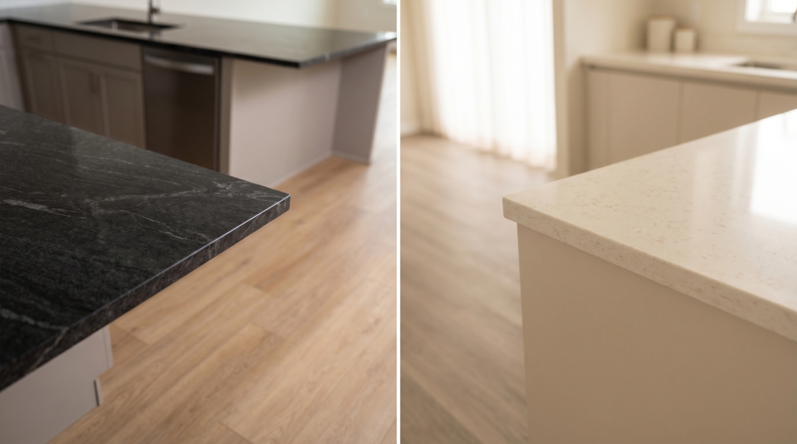
- Tone Harmony: A countertop and a flooring material must match on tone. If your countertop is a warm tone (like a gold or beige undertone), your floor should be a warm tone, too (like an oak floor). If your countertop is cool-toned (like a blue or grey undertone), your floor should be a cool tone, too (like a slate floor). A warm granite countertop with a cool grey SPC floor creates a tension between surfaces, so the visual appearance does not feel resolved, regardless of lighting condition. However, a warm granite countertop with a warm greige SPC floor looks coherent at any angle or light condition.
- Value contrast: The countertop and floor should contrast each other on a light-to-dark scale, so neither material merges with the other and you see a separation between planes. Dark granite with a light SPC floor is a good example as it visually defines each horizontal surface. A clean, minimalist look can be achieved by pairing light colors for countertop and floor, but this requires very specific shades so that neither is indiscernible from the other. Pairing a mid-tone granite with a mid-tone SPC floor creates a flat visual field where neither surface defines itself as distinct, and that fails 60-120 times over.
- Material Register Consistency: This refers to the perceived value level of the countertop material and the flooring material. Pairing a very high-quality material, such as quartzite countertop with a 6mil residential SPC floor, creates an imbalance because the floor has an obviously lower register value than the countertop. However, a premium wood-look print on a commercial-grade, 20mil SPC floor paired with a quartz countertop signals both surfaces carry the same quality value. The materials themselves do not have to be the same type; they must be within the same quality register.
- Zone Differentiation: In an open floor plan layout, the countertop and the flooring work together to establish the kitchen area. A granite or quartz countertop in the kitchen zone indicates the boundaries of a kitchen work surface. The floor could be a continuous flooring through all zones of the living area or it could transition at the kitchen/living zone line. Both designs have the potential to succeed; the developer should make a conscious choice of what they will be doing in each scenario.
| Quick answer:
The 4 rules for countertop-flooring co-specification: tone harmony (both warm or both cool), value contrast (the colors need different levels of lightness/darkness), material register consistency (quality needs to match), and zone differentiation (a deliberate design choice in an open plan is needed between continuing floor or transitioning floor to mark zone). They all need to be met. Failing on one results in a visual problem. |
| Industry Data:
NKBA 2025 (nkba.org)-mismatch between tone of countertop and flooring has been noted as the most consistent problem in specifying countertop and flooring materials for BTR and residential developments. Over 68% of all post-occupancy material complaints on kitchens are related to countertop/floor combinations that appeared right on samples, but not upon installation. NAHB 2025 (nahb.org)-developers utilizing a single-supplier specified material palette for countertop and flooring selections have far fewer material combination complaints post-installation than those selecting materials independently. |
| One important tip to remember:
Test your countertop and flooring in the actual unit using the same light condition as intended for installation, both under natural and artificial light, at the developer’s site (not on your desk or in a showroom). This simple test is the best way to catch any material combination problems before 60 units are completed. If the pairing looks good in both types of light conditions, it should work in all 60 units. |

- 8-Combination Reference – What works in Development.
Eight countertop-floor pairings reviewed for visual appearance and correct development application – including the one combination that looks okay in the showroom, and looks wrong every time, in the development process. The middle tones on middle tones row above is the critical development contractor error. Countertop value level same as floor value level = flat. Flat looks okay in a photo and looks wrong in a unit. This error is usually too subtle for occupants to explain “why doesn’t this kitchen feel right?”, but is repeated often enough to appear consistently across all occupancy/post-occupancy survey results for projects.
| Countertop + Floor Combination | Visual Result | Best Development Application |
| Dark granite (absolute black, dark verde) + light oak or blonde SPC | Maximum contrast. The countertop is the statement. The floor is the canvas. Clean and contemporary. | Open-plan BTR kitchens. The contrast defines the kitchen zone visually from the living area without a physical divider. |
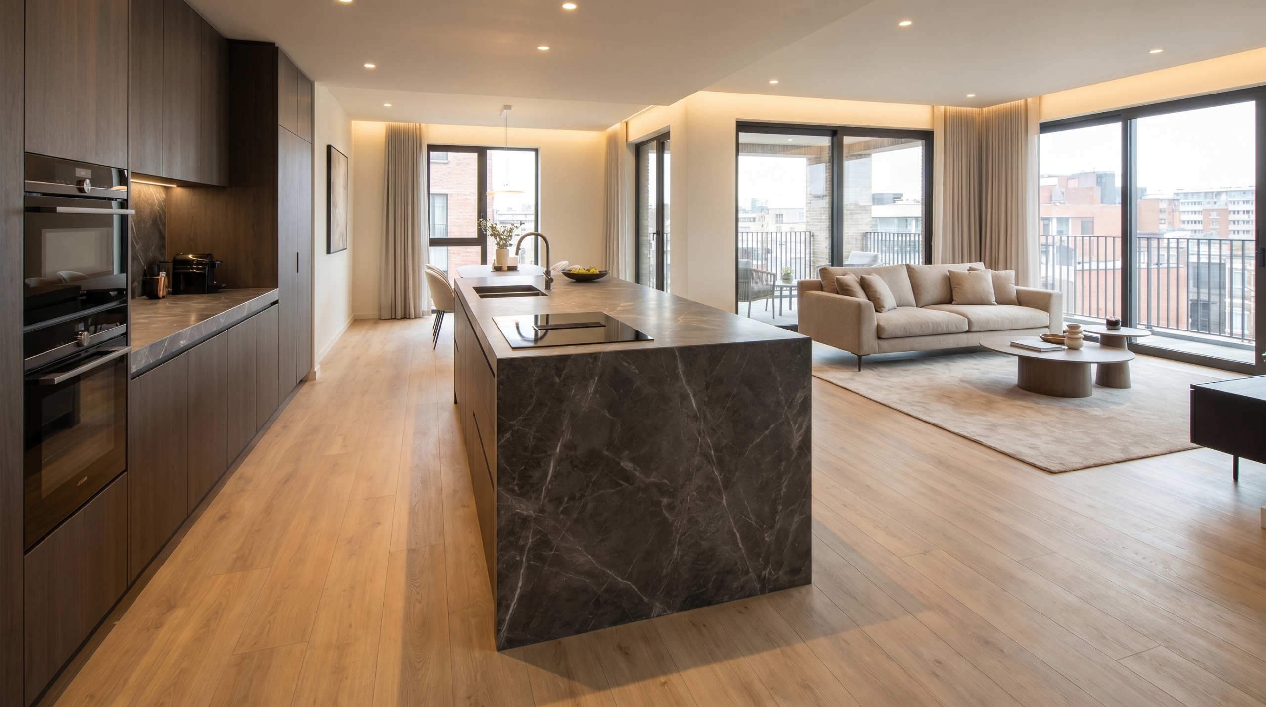
| Dark granite + dark walnut SPC or hardwood | Tone-on-tone. Rich and dramatic but requires strong natural light or the combination reads as heavy. | Luxury BTR with large windows. Boutique hotel rooms with warm artificial lighting. Not for north-facing rooms. |
| White or light grey quartz + greige or warm grey SPC | Warm neutral cohesion. Neither surface dominates. The room reads as a calm, consistent whole. | The most widely specified BTR combination in 2026. Works in any room size and any light condition. |
| Light quartz or granite + dark espresso SPC | Reversed contrast — light countertop, dark floor. The floor anchors the room; the countertop brightens the work zone. | Premium BTR and boutique hotel where an interior designer has specified the material pairing deliberately. |
| Mid-tone grey granite or quartz + mid-tone grey SPC | Tonal conflict — similar values with no clear contrast. The result is a visually flat, undifferentiated appearance. | Avoid at development scale unless texture difference (stone grain vs wood plank) creates sufficient differentiation. |
| Quartzite or premium granite + wide-plank engineered hardwood | Natural-on-natural register. Premium material quality communicates clearly. The most distinctive development combination. | Luxury BTR, boutique hotel rooms, high-spec residential where both materials are appropriate and maintainable. |
| White quartz + large-format stone-look SPC (60×30 tile format) | Monolithic, contemporary. The floor tile format reinforces the stone aesthetic of the countertop. | BTR open-plan where a clean, minimal, modern aesthetic is the brief and no wood floor is required. |
| Granite countertop + matching stone-look SPC floor in same tone | Tone match with material differentiation. The countertop and floor read as intentionally coordinated. | Upscale BTR and hotel where a deliberate tonal story across all surfaces is part of the design brief. |
Combination data based on NKBA design specification guidelines, NAHB developer data 2025, and Pack Universe Supply development project specification data April 2026.
| Quick answer:
The most consistently successful combination at a BTR development scale is a dark countertop with a light floor. This is because it will work in any size room, any level, and any orientation. The dark countertop appears as a solid object regardless of the light, and the light floor reads as the ground. There isn’t an orientation or season in which this combination will appear flat or unresolved. At the development level, a combination that works well in variable conditions will always outshine a combination that works best in one. |
A BTR developer who chose mid-tone grey quartz counters and mid-tone warm grey SPC flooring for his project-because both products were great choices on their own and a designer wasn’t part of the team due to project constraints- ended up with 80 kitchens where the counter and floor looked like one indifferentiated grey surface. Both the products were well-chosen but had zero value contrast between them when placed together. At development scale, combinations that are good together at different values and are also good on their own are always superior.
- Tone Warm vs Cool – The Decision that Cannot be Made from Individual Samples
Tone harmony between countertop and floor is one of those specifications where the two materials may look okay individually on a sample card, but they clash terribly in the same space under the same light. Every stone and SPC flooring product has an undertone-a hidden temperature bias. These tones may either lean toward beige, gold or red, or toward gray, blue or green. Individually, these two can look good-a stone with warm brown undertones is a fine warm choice, while a floor with cool gray undertones looks fine in a modern space-but they may clash in reality. Together, these two tones can make a space feel unsettled for no discernable reason.
The way to test undertone compatibility is easy: place your two samples on a neutral background (your actual countertop sample and flooring sample) next to each other under the intended light and view them from a standing position. Whichever combination appears to belong to the same palette when viewed from a standing height will look the most intentional and cohesive. Whichever combination appears to clash will also appear to clash, no matter how well the samples look on their own.
Warm Palette combinations that work at development scale:
Warm granite (brown, gold, or green undertone) with warm oak SPC: This pairing uses natural material to warm the space. The warm tones in the granite can complement those in the oak SPC for a cohesive feel.
Warm quartz (cream, beige or gold-veined) with greige or blonde SPC: The top warm palette combination ordered in 2026; this works in every orientation and shows up wonderfully in photographs for marketing.
Dark walnut SPC with warm mid-tone granite: This combination is warm, rich and a bit higher in perceived value, though it requires the use of natural or warm artificial light in the space so that the pieces correctly portray their values.
Cool Palette combinations that work at development scale:
Cool gray quartz (Calacatta-look, Statuario-look) with cool gray or concrete-look SPC: This is the perfect clean, modern choice and works in every light but needs a value contrast to appear successful and not flat.
Absolute black granite with pale gray or light stone-look SPC: This is a dramatic, cool choice and will add a strong element to any space; it requires contrast for success but the countertop provides that to the floor in this case.
Cool light quartz with dark charcoal SPC: This combination provides reversed value contrast, so the floor provides the grounding and the countertop brightens the work surface; works best in very light spaces.
| Quick answer:
Before confirming a development-scale countertop and floor combination, test undertones of both samples in the unit itself under natural and artificial light from standing height. Only confirm when both samples read correctly under both light conditions and both belong to the same palette; a clash in any context suggests a bad choice. |
It is crucial to understand that the samples seen on different sample boards are not a representation of a completed installation. Two individual pieces of stone and SPC may look appealing on their own, but if they lack inherent compatibility and value contrast, they will look much poorer when installed together.
| Specifying countertops and flooring for a development?
Send us information on the type of development, number of units, and design brief, and we’ll provide a combination that fits from our available inventory, share coordinated samples, and then give you a consolidated wholesale quote. +1 704-951-7822 | packuniversesupply.com/request-a-quote |
- Scalability – Getting 60 Units to Look Alike
What looked good in a sample unit needs to be confirmed in production. Production lot confirmation, batch specification, and a single-supplier order will be needed to ensure that unit #1 and unit #60 are identical.
In a large development, determining the specification in a sample flat is only part of the puzzle. The second half of the puzzle is that all the materials delivered to units #1 – #60 have to look the same and be from the same batch. Subtle tonal variations can occur between different SPC floor production batches, as can tone differences and veining density in different batches of granite. Where the developer has separately ordered flooring and countertops from different suppliers on separate deliveries, multiply the number of possible batch variation instances by the number of supply events.
The simplest approach for dealing with consistency at scale, in order to ensure that unit #1 and unit #60 are visually identical, is to: order both countertop and flooring from a single supplier; get that supplier to confirm production lot and batch number at Phase 1 ordering time; reserve all the material from these batches for the full development quantity before the first delivery. This means that the single-supplier won’t face the problem of matching toner to different tones; and the number of batch confirmation conversations is only one, not two.
Order countertop and flooring from the same supplier. The tone will be maintained by the same supplier and they can provide samples that match against a single palette. This reduces specification risk.
At Phase 1, confirm production lot or batch for countertops. Full development quantities will be reserved in one batch before units receive their supply.
At Phase 1, confirm batch code forSPC Flooring. SPC will not cross batches for units #1 – #60, and units #1 – #60 will match.
Install sample unit before full rollout. Installing the selected combination in one unit and looking at it under all light conditions before confirming full development supply prevents costly mistakes down the road.
The sample unit review costs one installation; while post-installation change-out will cost the full development quantity.
| Risk Vs. Reward.
Risk: Approval of countertop and flooring separately from different suppliers based on different sample, ordering in batches as units are ready for finishing, and not linking them through batch and supply events. Result: At Phase 3, the SPC flooring is a slightly warmer tone; and a granite batch changes significantly to a warmer tone because the company has moved quarries. While units #1-20 and #41-60 meet individual specification requirements, when the developer sees them adjacent at completion they do not look identical. There’s a cost to rectifying this. |
A visually consistent development doesn’t happen randomly. It happens when batch confirmation and sample review are addressed at Phase 1. Units #1-60 don’t match because they were not, for the reasons outlined above. Both the consistent development and inconsistent development start with the same decision (made or not made) at the outset, when deciding on specification for countertop and flooring material.
| In short: Co-specification of countertop and flooring: use the same supplier. Batch for granite; SPC production code; assign it at Phase 1; reserve all units; install sample unit. Check it before starting to deliver. No fancy deals; just asking the right questions at the right time. |
| Pack Universe Supply Support Co-Specification of Countertop & Flooring:
Our Charleston, SC warehouse has both stone countertop products (quartz, granite) and SPC flooring in stock for developments. We can provide coupled palette samples for viewing countertop and flooring material; production lot/batch numbers for granite and SPC; and reserves the quantities needed before any unit supply event. Large scale development? Give us the number of units; type of room; and design vision and we’ll find you 3 or more suitable countertop/flooring combination options available for the full quantity at our Charleston facility. We would love to hear from you: +1 704-951-7822 |
| Order your Matched Countertop & Flooring for Development From one Supplier, same Batch#
Granite, Quartz, and SPC Flooring. Matched by color and batch number and guaranteed full volume availability. Charleston SC (USA) | Burlington ON (Canada). Packuniversesupply.com/request-a-quote | +1 704-951-7822 |
Verdict: How to match countertops to flooring for developments
There are 4 rules a countertop and floor should be judged by at development scale: tone, value, register, and zone. When a pairing satisfies the 4 rules it should look correct in every unit regardless of orientation or lighting. Any that miss 1 rule repeats it 60 or 120 times. The 8-pairing reference from Section 2 shows every major combination and the circumstances of its proper use. The mid-tone on mid-tone is the one to avoid as it is the most common failure of development materials, and while it is the least visually dramatic error, it is also the least forgiving. Consistency management across units: single supplier, verified lots and batches at phase 1, quantity reservation, sample unit approval before rolling it out. Each of those takes zero time extra to get them arranged and prevents you from hearing the words you don’t want to hear on completion.
Related Guides:
